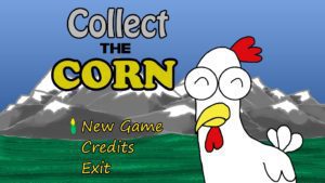
 Collect The Corn is a 2-D platformer for Windows. It was an experiment by me to explore the concept of a casual exploration-based environment with no death or significant penalties. It was a venture in developing an interest curve without many of the tools we usually employ in games.
Overview – Project Details
Development Time: 1 Month
Platform: Windows
Roles: Designer, Programmer, Artist
Tools: Zero Engine (DigiPen), Python, Photoshop
Video – Gameplay
Overview – Synopsis
Perhaps the best thing about making games in academia is the ability to test out concepts without the financial pressures that otherwise dictate much of game design. Successful platformers these days are skill-based, or have some novel new mechanic to fuel them. There are dozens of articles on Gamasutra that try to define why this is generally necessary. But I wanted to explore this a bit myself, experimentally. I decided to create a platformer that is quite easy, and relatively free of negative events.
In the class that I created this project in, DigiPen required the usage of their brand new “Zero Engine”, a 3D game editor similar to Unity. In addition to my design experimentation, this project was a useful training exercise in using in-house, undocumented, and feature-incomplete tools. Which is incredibly useful, because when do you ever actually get all the perfect tools? Plus, I was able to add another language (Python) to my arsenal!
Overall, this was a good learning experience that I’m thankful for having had the opportunity to experiment with. This may not have been the most engaging experience I’ve ever crafted, but it is a solid work, with a decent interest curve.
Details – Design Process
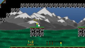
How challenging does a platformer need to be to be engaging? How easy can the core objective be, with optional more difficult sub-objectives? In this project, I wanted to test this concept. The primary goal is to simply collect “corn” scattered throughout the level, a great deal of which will be picked up just by walking around. To progress, the player will have to search a few hidden areas, but they’re frequent and plentiful enough that discovering a sufficient number isn’t a barrier. There are a number of more difficult to reach corns that require skilled jumping or dodging of enemies, but they are all entirely optional.
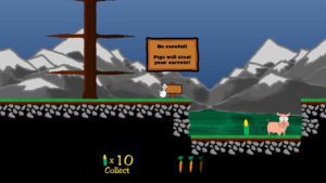
In keeping with this concept, I wanted to have “enemies” to make the world feel a bit more alive, but I didn’t want them to significantly penalize the player in any way. This chicken is immortal, and once it gets corn, it keeps it forever. The player has to pick up a sub-currency (carrots) to unlock chests. These carrots will appear randomly throughout the world, and the player generally will pick them up just by walking around. If the player gets hit, they lose a carrot, which means only that the player will have to walk around a short while longer to reach optional corn. It provides a minor threat, and a minor challenge in some locations, but in playtesting I found that these pigs increased player engagement significantly overall.
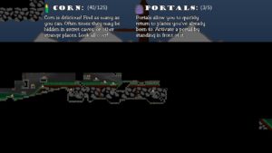
I like to just walk around in game worlds. Open world games are great for this. In the platformer world, the king and queen are Castlevania and Metroid. They are certainly skill based, but a huge draw of these games is that exploration; being able to return to areas you previously visited, see if you missed something, and come back with new abilities to access even more content. This was the basis of my level design. All areas are filled with a variety of hidden treasure, secret passageways, and platforms that won’t be accessible until later.
Details – UX Design
The biggest priority for the for the UI was to always ensure the player knew what their objective was, and how to go about that goal. Thematically, a bunch of HUD elements didn’t feel like it would fit, so I placed goals, guides, and instructions inside the world as much as possible. The biggest example of this is the Farmer. His role could just as easily be filled with a series of popup screens, but by having a character in the world explain these things, it makes the world feel a bit more alive. Playtesting the two methods definitely reinforced the importance of actually placing the Farmer in the game.
Other instructions are placed into the game world via signs that appear when the player stands in front of them. They are in open, high-traffic locations that the player cannot miss, but at the same time, they are optional. This lets the player make a conscious decision on how much training they want to receive. Only the most critical of instructions are forced upon the player (movement instructions if the player doesn’t move, and how to open the map).
Interestingly though, this approach has its effective limits. At the bottom of the screen are corn and carrot counters. I originally had these appear only when the map was opened, but players generally performed better and had more focus with those elements permanently present.
Details – Post-Mortem
Overall, most traditional gamers tended to get bored after about 10 minutes. Experienced gamers generally do want more challenge, and once they’ve mastered the floaty physics and explored around a bit, their interest tends to wane. What was interesting though was that non-gamers’ interest was retained for much longer, usually the duration of the game. I did not necessarily set out to create a game for non-gamers, but it raises some questions about what components are necessary because of human nature, and what components are necessary because that’s just how the core demographics have been trained.
I would have liked to have polished this game more and refined the level layout further. But alas, this was a project where I spent more time dealing with technical implementation than production and design. Still, I set out to learn more about design theory, and I definitely accomplished that.
Download – Full Game
The full game is available as a standalone executable. Click here to download.


